Design Review Software: 8 Tools for Team Feedback
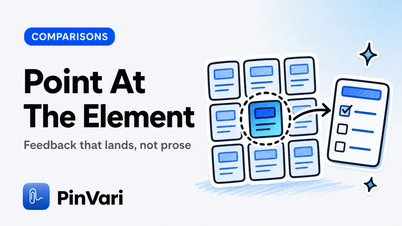
The best design review software lets a reviewer point at the exact thing that is wrong and route that feedback straight to the person or agent who will fix it. For teams shipping software, that means capturing the named UI element (its role, label, and position), the spoken or written note, and a screenshot cropped to the problem, then filing it to Linear, GitHub, or an AI coding agent.
Most design review software gets this wrong because it captures a pixel rectangle and a comment, and the developer still has to guess which of the four buttons in the crop you meant.
Feedback written in prose gets misread. A founder or PM who reviews builds all day knows the loop: you write "the spacing on the pricing card feels off," the developer reads it three different ways, and two rounds later the wrong card moved.
What is design review software, and what should it do?
Design review software is any tool that lets someone inspect a build or design, mark up what needs to change, and hand that feedback to whoever ships the fix. Good tools do four things well: capture the exact element, attach visual proof, carry the reviewer's intent in their own words, and deliver it to the tracker or agent without a copy-paste ritual.
The weak version stops at annotation. You draw a box, type a comment, and email a link. The strong version resolves the target, so the person receiving it never asks "which one?"
There is a real split between design QA and a broader design review process. Design QA is the last-mile check that the built UI matches the spec: right font, right spacing, right states.
The design review process is wider, covering flows, copy, and product decisions before and after a build. Both need the same primitive: feedback anchored to a specific, named thing on screen.
The difference between a design review tool people love and one they abandon is whether the feedback lands as an executable target or as prose someone has to interpret. Named elements land. "The button on the right" does not.
The 8 best design review software tools
Here is an honest comparison across the tools teams actually reach for. No tool wins every column, and the right pick depends on whether you review inside a browser or across native apps.
PinVari
Where it works: Native macOS apps, Electron, browsers
What it captures: Named AX element (role, label, frame) + cropped screenshot
Routes to: Linear, GitHub, Slack, MCP agents
Voice: Yes, on-device
Price: $39 one-time (launch, then $59)
Jam.dev
Where it works: Chrome, Edge
What it captures: Console logs, network, DOM snapshot
Routes to: Jira, Linear, GitHub, Slack
Voice: No
Price: Free, $20+/mo team
Marker.io
Where it works: Browser only
What it captures: Freeform annotation over the DOM
Routes to: 50+ integrations
Voice: No
Price: $39+/mo per workspace
BugHerd
Where it works: Browser only
What it captures: Pinned comments on a web page
Routes to: Trello, Jira, Slack
Voice: No
Price: $39+/mo
Pastel
Where it works: Web pages, some design files
What it captures: Comment pins on a shared URL
Routes to: Slack, email
Voice: No
Price: $24+/mo
Figma comments
Where it works: Figma files
What it captures: Threaded comments on frames
Routes to: Figma, Slack
Voice: No
Price: Free with Figma seat
CleanShot X
Where it works: macOS
What it captures: Pixel screenshots, annotation
Routes to: Manual paste anywhere
Voice: No
Price: $29 one-time
Loom
Where it works: Anywhere on screen
What it captures: Screen recording + voice
Routes to: Link sharing
Voice: Yes
Price: Free, $12.50+/mo
The pattern is clear once you line them up. Browser tools like Jam.dev, Marker.io, BugHerd, and Pastel are excellent inside Chrome and useless the moment you open Xcode, a Tauri app, or a Slack desktop window.
Loom captures voice but leaves the receiver scrubbing a video to find the frame. Figma comments live where the design lives but not where the built app runs.
If you review across native macOS apps, the Jam.dev alternative for native Mac apps breakdown covers why a Chromium-only tool cannot see an Electron or SwiftUI window at all. And if you currently paste raw screenshots, the CleanShot X alternative comparison explains what a pixel-only capture leaves on the table.
How does design QA differ from a design review process?
Design QA is verification; the design review process is a decision. Design QA asks "does the built screen match what we designed?" and produces a punch list of pixel-level fixes.
The review process asks "is this the right thing, built the right way?" and produces direction, not just corrections.
They fail for different reasons. Design QA fails when the reviewer cannot name the element precisely, so "the padding is wrong here" turns into a guessing game.
The review process fails when feedback arrives as a wall of prose with no anchor, so the team debates interpretation instead of the design.
Run design QA against named elements and a design review process against flows. For the punch list, capture the element by role and label so the fix is unambiguous. For the flow discussion, record intent and context so the team argues about the product, not about which screen you meant.
The reason named elements matter for both is the same reason they matter to machines. When you learn how AI agents know which UI element you are describing, you see that the accessibility tree the operating system already maintains is the cleanest possible anchor.
It is stable across builds, it has a role and a label, and it does not move when the layout reflows.
What breaks a design review process on native apps?
The design review process breaks on native apps because most design review software only understands the browser DOM. Chrome extensions read the page's DOM, so they can pin a comment to a <button> and grab its selector.
Open a native macOS app, an Electron editor, or a game canvas, and there is no DOM to read, so those tools capture a flat screenshot at best.
That is a big blind spot. A modern product team reviews the marketing site in Chrome, the desktop app in Electron, the mobile companion in a simulator, and the internal tooling in a native window.
A browser-only design review tool covers one of those surfaces. The blind spot is not the browser; it is everything outside it.
macOS solves this at the OS level. The Accessibility API exposes the element under any point on screen through AXUIElementCopyElementAtPosition, returning its role, title, value, frame, and parent chain.
That is the same tree VoiceOver and keyboard navigation rely on, so it works in native apps, in Electron, and in Safari and Chrome through the AXWebArea. When you point at a control, the OS can tell you it is an AXButton labeled "Publish," not a rectangle at pixel 1142, 687.
Accessibility data can be empty on canvas-rendered surfaces such as games and some design tools. When the AX tree is sparse, capture falls back to on-device Vision OCR to read visible text, so you still get a cropped screenshot and a note. Treat an OCR-derived element name as a guess, not a resolved fact.
There are honest edge cases in resolving the element. A topmost overlay would hit-test to itself, so the resolver has to walk the on-screen window list and hit-test the real app underneath.
Electron and Chromium build their accessibility tree lazily, so the tool sets AXManualAccessibility and retries for a moment until labeled elements appear. When a point lands on a bare AXGroup, it descends to the deepest labeled child.
These are the details that separate a real design review tool for engineering work from a screenshot annotator.
Design review software for engineering teams shipping with AI agents
For engineering teams, the newest requirement for design review software is that feedback should be consumable by an AI coding agent, not only a human. If your workflow includes Claude Code, Cursor, Codex, or Zed, the agent needs a named target it can look up in the codebase, not a PNG it has to OCR and guess against.
This is where design review software engineering teams diverge from marketing-only workflows. The reviewer circles the broken element and speaks the change; the tool resolves the named element with a confidence score and hands it to a local MCP server on 127.0.0.1.
The agent calls a tool, receives the element role, label, frame, and cropped screenshot, and can search the code for the label to find the exact SwiftUI or React declaration.
The routing matters as much as the capture. A point-and-speak bug report to Linear and GitHub files the named element as a structured field so a developer clicks straight to the code, while the same capture can go to an agent that writes the fix or a regression test. One capture, three possible destinations is what a modern design review tool should offer.
The interaction is deliberate and on-device. You hold ⌥⌘A, circle or point at the element, speak your note, and press again or hit return to finish.
Transcription and OCR run locally through Apple frameworks, nothing uploads by default, and you bring your own agent. For teams that care about privacy and about feedback landing without a follow-up, PinVari ships this at a one-time $39 launch price with no subscription for the core app.
FAQ
What is the best design review software for a small product team?
It depends on where you review. If everything lives in the browser, Jam.dev or Marker.io cover you cheaply.
If you review native macOS apps, Electron windows, or IDEs, pick a tool that resolves the named accessibility element on those surfaces, because browser-only tools capture nothing but a flat screenshot there.
Is design review software the same as design QA software?
They overlap but are not identical. Design QA software focuses on verifying that a built screen matches the spec at the pixel level, while design review software covers the broader review process including flows, copy, and product decisions.
The best tools serve both because both need feedback anchored to a specific named element.
Can design review software send feedback to an AI coding agent?
Yes, if it exposes a local MCP server or a structured export. An agent needs the named element, the instruction, and a cropped screenshot to act reliably, rather than a raw image it has to interpret.
Tools that resolve the accessibility element can hand that data to Claude Code, Cursor, Codex, or Zed directly.
Why do browser-only design review tools miss native apps?
Chrome extensions read the browser's DOM, which does not exist outside the browser. Native macOS apps and Electron windows expose their structure through the Accessibility API instead, so a design review tool has to read that tree to capture anything more than a pixel screenshot.
That is why a Chromium-only tool cannot pin feedback to a control in Xcode or a desktop app.
How do I make design review feedback unambiguous?
Anchor every note to the named element rather than its position or color. "AXButton 'Publish' overlaps the footer at 320px width" is unambiguous; "the button at the bottom looks broken" is not.
Naming the element also lets developers search the codebase for the label and lets agents look it up directly.
Is there a design review tool that captures voice feedback?
Yes. Loom captures a screen recording with voice, and point-and-speak tools on macOS capture voice as a transcribed note attached to a named element.
The advantage of the latter is that the receiver gets structured data plus the element, not a video they have to scrub to find the moment you meant.
Hand your agent the exact element
PinVari resolves what you point at into a named, executable instruction — on-device, no keys, your own agent. One click inside PinVari connects Claude Code, Cursor, VS Code or Codex — or paste one CLI line from pinvari.com/connect.
PinVari → Connect → your agent (one click)Get PinVari — $39 →