UI Testing Checklist for Visual Bugs
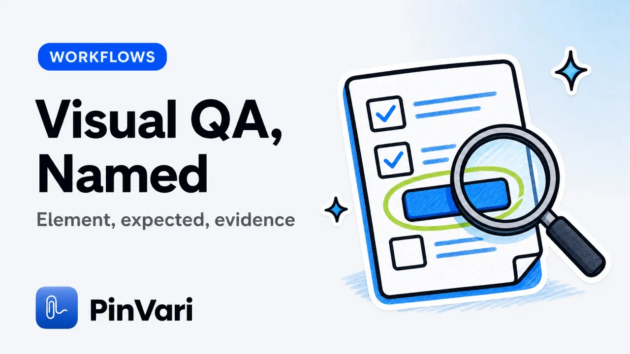
A UI testing checklist is a repeatable list of visual and interaction checks you run before you file, plus the fields every report must include. The useful version names the element, states current vs expected, and attaches a cropped region, not a whole desktop.
Most checklists read like a design-system sermon. Testers need a shorter list they can finish on a real build, in a real window, on a real Mac.
I file a lot of visual bugs. The ones that get fixed on the first pass all share the same skeleton. The ones that bounce are "the button on the right looks off."
Use this as a pre-flight before you open Linear or GitHub. Pair it with a solid bug report example when you write the ticket.
What belongs on a UI testing checklist?
A UI testing checklist has two layers. Layer one is what you inspect. Layer two is what you record when something fails.
Layer one, inspect: layout, type, contrast, hit target, focus order, empty and error states, overflow, and the same screen at two sizes. Layer two, record: named element, steps, current, expected, environment, evidence.
Name the element before you write the story. "AXButton Checkout in Cart Footer" plus two sentences beats a five-paragraph novel that never says which control.
If you need a reminder of ticket shape, the format of a bug report is the same fields. This checklist is how you notice the bug in the first place.
A visual bug without a named element is a screenshot with homework attached. The developer still has to find the control. Do that work in the report.
The UI testing checklist, copy-paste
Run these in order. Stop and file when a row fails. Do not batch ten vague notes.
[ ] Identify the screen and the focused window
[ ] List interactive controls you will touch (buttons, fields, tabs, menus)
[ ] For each control: visible label, enabled state, hit target
[ ] Empty state, loading state, error state
[ ] Overflow: long strings, 200% zoom, small window
[ ] Keyboard: tab order, focus ring, escape
[ ] Contrast of text and icons on this background
[ ] Two widths (narrow and default) and, if you have it, a second display
[ ] File failures with: element, current, expected, steps, evidence
Keep the evidence cropped. A full-screen PNG trains people to squint. A region plus the role and label trains people to fix.
On macOS you can fill the element line from Accessibility. Hold ⌥⌘A, circle the control, speak the failure. Dwell (~0.2s hover) also resolves a control if you do not want to draw.
Circle three failures in one breath if they are on the same screen. Per-mark word buckets keep each control's note attached to that mark, instead of one caption for the whole window.
How should QA write the failure line?
Write one sentence for current, one for expected. Then steps. Then environment.
Current: "AXButton Save stays disabled after the name field is filled." Expected: "Save enables when name is non-empty." Steps: open New Project, type a name, look at Save.
Environment is OS, app version, display, and whether you were scrolled. Scroll-aware marks matter because a control that was off-screen still has a frame.
If you pause mid-page, ⌥⌘P lets you resume without losing marks. Scrolled marks should keep their own screenshot frame.
This is also where software testing tools earn their keep. A tracker that cannot store an element name forces you back into prose.
Visual layout
Check: Alignment, spacing, clipped text, overlapping controls.
Fail if: A control is unreadable or untappable.
Record: Element frame plus cropped shot.
Interaction
Check: Click, hover, keyboard, disabled logic.
Fail if: The control does the wrong thing or nothing.
Record: Steps and the named control.
State coverage
Check: Empty, loading, error, success.
Fail if: A state is missing or reuses the wrong copy.
Record: Which state, which element.
What visual bugs do AI agents still get wrong?
Agents edit the wrong sibling. Two buttons share a label prefix, the model picks the first, the report never said which.
Agents also "fix" style in the wrong file because the screenshot showed a whole page. Crop. Name.
Confidence below 0.8 should ask, never guess. If your capture tool cannot score the hit, you are the score. Write "not sure which of two Saves" instead of pretending.
Canvas and some Electron surfaces have a thin AX tree. On-device OCR is the fallback. Say so in the ticket: "AX-blind, OCR label is Submit."
Browser-only tools will not see a native IDE or a desktop Electron window. Jam.dev is excellent in Chromium and captures console logs. It cannot file a native macOS control.
Marker.io is the agency annotation default at $39+/mo. Same limit: website, not the rest of the desktop.
If your product under test is a website, those tools are fine. If it is a Mac app, use a native capture path.
Multi-display and scroll: the two checks teams skip
A surprising number of "it looks fine here" bugs are display bugs. The mark was drawn on the laptop and the screenshot came from the studio display, or the other way around.
Each mark should remember which monitor it was drawn on. One capture can span screens. If your tool cannot do that, test one display at a time and write the display in the environment line.
Scroll is the other skip. Testers screenshot the viewport and lose the control that caused the bug after a scroll. Full focused-window text (up to 40,000 characters, including text scrolled out of view) plus an interactive-element map is the honest context pack.
Optional whole-screen OCR helps when AX is empty. Do not make whole-screen OCR the default for every ticket; it is noisy.
Do not file a UI bug from memory after you closed the build. Re-open, circle, speak. Memory invents which toggle you meant.
How this checklist feeds Linear, GitHub, and agents
The checklist is not a second tracker. It is the quality gate before the tracker.
When a row fails, file once. Linear, GitHub, or Slack. Same fields.
If you work with Claude Code or Cursor, the same bundle can go over a local MCP server on 127.0.0.1. The agent-facing tool returns the resolved path, the spoken instruction, the region, and a cropped screenshot.
pinvari_mark_done closes it. Mid-task, the agent can call pinvari_request_capture and you point again.
For team process around tools and seats, software testing management tools covers the tracker side. This page stays on the visual pass.
If you want the capture loop on a Mac without a subscription for the core app, PinVari is $39 at launch (first 500 licenses, then $59) via Polar. macOS 14+, Apple Silicon and Intel, notarized Developer-ID DMG.
Nothing uploads by default. Transcription and OCR stay on-device. You bring your own agent.
How do I run this UI testing checklist in 15 minutes?
Time-box the pass so it actually happens. Fifteen minutes on the build beats a 90-minute plan you skip.
Minutes 1-3: name the screen and list the interactive controls you will touch. Write the names down, even if they are ugly.
Minutes 4-8: walk empty, loading, error, and success. File on the first real failure. Do not collect a dozen fuzzy notes.
Minutes 9-12: overflow and a second width. A long string and a narrow window catch half of the visual bugs I see.
Minutes 13-15: keyboard and one other display if you have it. Then stop. A second pass tomorrow is better than a sloppy extra ten minutes.
File during the pass, not after. Memory invents which toggle you meant once the build is closed.
If you review on a Mac, keep the capture hotkey in your left hand. Circle, speak, next control. The Command Center groups captures by app so the next session starts from a pile you can search.
Crash-safe session recovery matters when the app under test takes the whole session down. Re-open, recover marks, keep going.
A checklist that lives only in a wiki will rot. Paste the nine boxes into the tracker template so the fields are the same place you file.
When an agent is in the loop, treat the checklist as the spec for pinvari_next_instruction. The spoken line is the current-vs-expected pair. The resolved path is the location.
QA that talks to developers in Slack without those fields is just a meeting scheduled for later. Use the checklist as the tax for talking.
FAQ
What is a UI testing checklist?
A UI testing checklist is a short, repeatable list of visual and interaction checks, plus the fields you record when a check fails. It is not a 200-row test-case spreadsheet.
The job is to notice the bug and file it so a developer or an agent can act without a meeting.
How is a UI testing checklist different from a test plan?
A test plan covers scope, risk, and environments. A UI testing checklist is what you actually click through on a build.
You can attach this checklist to a plan. Do not replace the plan with it, and do not replace this with a plan nobody runs.
Do I need screenshots if I name the element?
Yes, for humans. The name is for search and for agents. The crop is for proof.
A named element plus a cropped region is the pair. A full-screen PNG alone is the weak form.
Can this UI testing checklist work for mobile web?
The inspect layer still applies. The capture layer depends on where you run the build.
If you test in a desktop browser, browser tools are enough. If you test a native Mac wrapper or an Electron shell, you need desktop capture.
What should I do when two controls have the same visible label?
Record the parent group and the role. AXButton Save in AXGroup Modal Footer is not the same as AXButton Save in AXGroup Page Header.
If you can, include AXDOMIdentifier or AXDOMClassList on Chromium. If confidence is low, say so.
How do I keep QA and developers on the same checklist?
Share the field names, not a PDF. Title, element, current, expected, steps, evidence.
If the tracker template matches the checklist, people stop inventing new headings. That is the whole trick.
Hand your agent the exact element
PinVari resolves what you point at into a named, executable instruction — on-device, no keys, your own agent. One click inside PinVari connects Claude Code, Cursor, VS Code or Codex — or paste one CLI line from pinvari.com/connect.
PinVari → Connect → your agent (one click)Get PinVari — $39 →